
Modern embedded user interfaces often require users to choose from a predefined set of options. Whether selecting a language, choosing a display mode, configuring a system parameter, or switching between operating modes, presenting users with a clear and structured selection mechanism is essential for creating intuitive interfaces.
While buttons and menus can be used for selection, they may consume valuable screen space and become difficult to manage as the number of options grows. This is where the ComboBox Widget in Sparklet becomes particularly useful.
The ComboBox Widget combines compact design with flexible selection capabilities, allowing users to choose an option from a dropdown list while occupying minimal screen space. It provides a familiar interaction model that users already recognize from desktop, mobile, and modern embedded interfaces.
In this article, we explore the ComboBox Widget, its key configuration options, practical applications, and how it helps developers build efficient embedded user interfaces.
Why Selection Controls Matter in Embedded UI
Embedded devices often present users with a limited set of valid choices. Allowing unrestricted input can increase complexity, introduce validation requirements, and create opportunities for user errors. For example, users may need to select:
- Language preferences
- Display themes
- Network configurations
- Temperature units
- Product operating modes
Rather than asking users to manually enter values, a dropdown selection provides a faster and more controlled user experience.
The ComboBox Widget ensures users can select only valid options, improving usability while simplifying application logic.
What is a ComboBox Widget?
A ComboBox Widget is a user interface component that combines a display field with a dropdown list of predefined options.
Initially, the widget displays the currently selected value. When the user interacts with the widget, a dropdown menu appears, presenting all available choices. The user can then select the desired option from the list.
Once selected, the chosen value becomes the active selection and is reflected in the associated application data.
This approach helps maintain a clean interface while still supporting multiple selectable options.
For embedded systems where screen space is often limited, the ComboBox Widget provides an efficient alternative to displaying multiple buttons or radio controls.
Configuring the ComboBox Widget in Sparklet UI Designer
Sparklet UI Designer provides several configuration options that allow developers to customize the appearance and behavior of the ComboBox Widget.
One of the most important configurations is Current Value Mapping, which connects the widget to the application data model. The selected value is stored and managed through the mapped data variable, ensuring synchronization between the user interface and application logic.
Developers can also configure dropdown positioning and dimensions through properties such as:
- Dropdown Offset
- Dropdown Height
- Dropdown Item Height
These settings help control how the dropdown list appears relative to the widget and ensure that it fits appropriately within the available screen space.
For touch-enabled embedded devices, proper dropdown sizing significantly improves user interaction and accessibility.
Customizing the Visual Appearance
User experience is heavily influenced by visual consistency. Sparklet UI Designer allows developers to customize the appearance of the ComboBox Widget to match product branding and UI themes.
The widget supports configuration of:
- Text Color
- Dropdown Background Color
- Dropdown Text Color
- Dropdown Selected Background Color
- Font Selection
These options make it possible to create interfaces ranging from industrial control panels to modern automotive displays.
Real-World Applications of ComboBox Widgets
The ComboBox Widget is widely used across various embedded industries because of its versatility and space-efficient design.
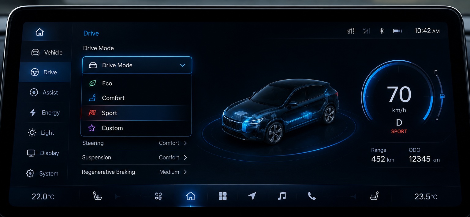
Automotive Systems
Modern vehicles offer numerous configurable settings. Drivers frequently need to select options such as:
- Drive modes
- Language preferences
- Display themes
- Unit systems
A ComboBox provides a compact and intuitive method for managing these selections.
Industrial HMIs
Industrial control panels often require operators to choose predefined parameters.
- Machine operating modes
- Production recipes
- Communication interfaces
- User access levels
Dropdown-based selection reduces operator errors while improving workflow efficiency.
Medical Devices
Medical systems commonly require controlled configuration settings.
- Monitoring modes
- Alert priorities
- Device profiles
Using a ComboBox ensures that only approved options can be selected.
Smart Home and Consumer Devices
Smart appliances frequently provide configurable options such as:
- Fan modes
- Energy-saving settings
- Operating schedules
- Network selections
The ComboBox Widget offers a clean and familiar interface for these tasks.
Benefits of Using ComboBox Widgets
One of the biggest advantages of a ComboBox Widget is its ability to present multiple options while consuming very little screen space.
Instead of displaying numerous buttons or menu entries simultaneously, the widget presents only the active selection and expands when needed.
This approach offers several benefits:
Improved User Experience
Users can quickly identify available options without navigating through multiple screens.
Reduced Screen Clutter
The dropdown approach helps maintain clean and organized interfaces, particularly on compact displays.
Controlled Input
Users can select only predefined values, reducing input errors and simplifying validation logic.
Consistent Application Behavior
Since all selections originate from a predefined list, application logic becomes easier to manage and test.
Flexible Styling
The widget can be customized to match the visual design of virtually any embedded product.
Conclusion
Selection-based interactions are a fundamental part of embedded user interfaces, and providing users with a clear and efficient way to choose options is essential for a positive user experience.
The ComboBox Widget in Sparklet offers a powerful yet compact solution for managing predefined selections. With support for customizable appearance, flexible dropdown configuration, data binding, and seamless application integration, it helps developers build intuitive and scalable embedded interfaces.
Whether used in automotive systems, industrial HMIs, medical devices, or smart consumer products, the ComboBox Widget enables efficient user interaction while keeping interfaces organized and easy to use. By leveraging its capabilities, developers can create cleaner, more user-friendly embedded applications that simplify configuration and improve usability.
https://sparkletui.com/documentation/flint-ui-designer/widgets/widgets.html#combobox-widget