
User interaction is a fundamental aspect of every embedded interface. Whether configuring system settings, enabling features, accepting preferences, or controlling operational modes, users frequently need to make simple yes-or-no decisions. While these interactions may seem straightforward, providing a clear and intuitive mechanism for representing binary choices is essential for creating an effective user experience.
The CheckBox Widget in Sparklet is designed specifically for this purpose. It allows users to toggle between two states, making it an ideal solution for enabling or disabling features, selecting options, and managing system configurations. With its simple visual representation and straightforward interaction model, the CheckBox Widget is one of the most commonly used UI controls across embedded systems.
In this article, we explore the CheckBox Widget, its functionality, configuration options, practical applications, and the benefits it brings to embedded UI development.
Why Binary Selection Controls Matter in Embedded UI
Many embedded systems rely on settings that can only have two possible states. Examples include:
- Enable or disable notifications
- Turn automatic updates on or off
- Activate power-saving mode
- Enable Bluetooth connectivity
- Select user preferences
In these scenarios, presenting users with a simple toggle mechanism improves usability and reduces confusion. Instead of requiring multiple buttons or complex navigation paths, a CheckBox provides a familiar and efficient interaction method.
The simplicity of a CheckBox allows users to immediately understand the current state and change it when necessary, making it one of the most intuitive selection controls available.
What is a CheckBox Widget?
A CheckBox Widget is a UI component that allows users to switch between two predefined states.
In Sparklet UI Designer, the widget typically consists of:
- A graphical check box image
- An associated text label
- Internal state handling for user interaction
The CheckBox supports two primary internal states:
Normal State: The Normal state represents the default or unchecked condition. This indicates that the associated feature or option is currently disabled or not selected.
Checked State: The Checked state represents the active condition. When selected, the associated feature or setting becomes enabled.
The transition between these states occurs through user interaction, providing immediate visual feedback and making the current status easy to understand.
Configuring the CheckBox Widget in Sparklet UI Designer
Sparklet UI Designer allows developers to visually configure the CheckBox Widget without requiring extensive programming effort.
After dragging and dropping the widget onto the design canvas, developers can customize various properties to match application requirements.
The widget can be configured with:
- Checked state image
- Unchecked state image
- Text settings
These configuration options help ensure visual consistency across the application while allowing the CheckBox to align with specific product branding and UI themes.
The ability to customize both the graphical representation and text appearance provides flexibility for a wide range of embedded applications.
Visual Feedback and User Experience
One of the key strengths of the CheckBox Widget is its ability to provide immediate visual feedback.
When users interact with the control, the graphical state changes instantly, clearly indicating whether an option is enabled or disabled. This feedback helps eliminate ambiguity and improves confidence during system configuration.
For example, when enabling a feature such as 'Automatic Brightness', users can immediately see whether the setting is active based on the checked or unchecked state.
This visual confirmation contributes to a more intuitive and responsive user experience.
State Management and Application Behavior
The CheckBox Widget uses internal states to represent whether an option is selected or not. The widget transitions between Normal and Checked states based on user interaction, providing a clear visual indication of the current selection.
Applications can monitor these state changes and perform the appropriate actions, such as enabling a feature, activating a mode, or updating a configuration setting. This state-based approach makes the CheckBox Widget an effective control for managing binary choices in embedded user interfaces.
Real-World Applications of CheckBox Widgets
The CheckBox Widget is widely used across numerous embedded industries because of its simplicity and effectiveness.
Automotive Systems
Modern vehicles include numerous configurable options that require binary selection.
- Auto-lock enable/disable
- Automatic headlights
- Driver assistance features
- Lane assist activation
A CheckBox provides a familiar method for managing these settings within infotainment and vehicle configuration screens.
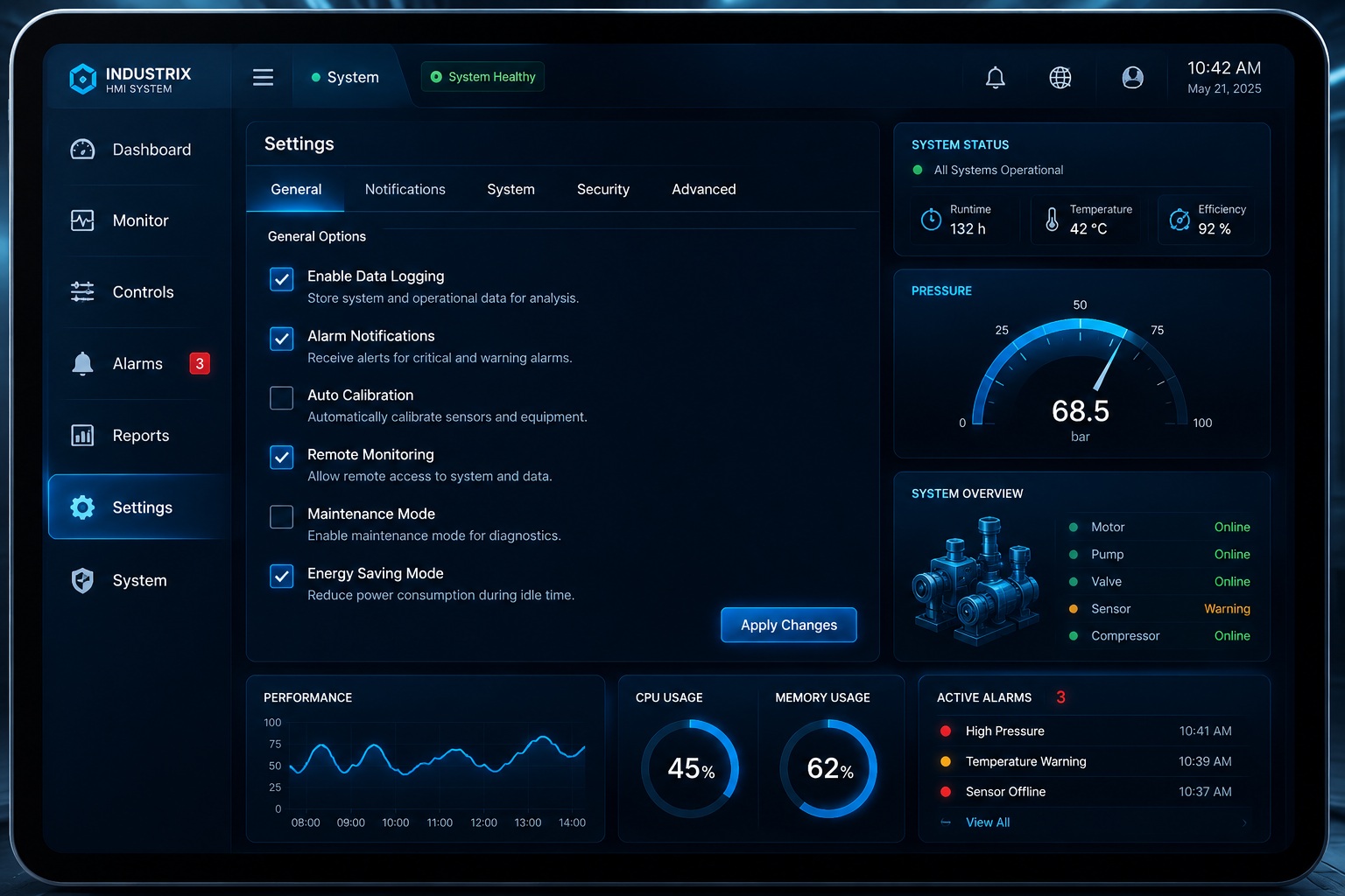
Industrial HMIs
Industrial systems frequently require operators to activate or deactivate specific functions.
- Data logging
- Maintenance mode
- Remote access permissions
- Alarm notifications
Using CheckBox controls simplifies system configuration and reduces operator training requirements.
Medical Devices
Medical equipment often includes settings that must be clearly enabled or disabled.
- Monitoring features
- Diagnostic functions
- Data recording options
The visual clarity of a CheckBox helps ensure that critical settings are easily understood by healthcare professionals.
Smart Appliances
Consumer devices commonly use CheckBox controls for user preferences.
- Energy-saving mode
- Child lock activation
- Automatic scheduling
- Notification settings
The compact design of the widget makes it particularly suitable for limited screen sizes.
Benefits of Using CheckBox Widgets
The CheckBox Widget offers several advantages that make it an essential component in embedded UI design.
Simple and Intuitive Interaction
Users immediately understand the purpose of a CheckBox because it is a universally recognized control.
Minimal Screen Space Usage
The widget occupies very little display area while still providing clear functionality.
Clear State Representation
Users can easily determine whether a feature is enabled or disabled.
Reduced Input Errors
Binary selections prevent invalid user input and simplify validation logic.
Event-Driven Control
The CheckBox Widget provides a straightforward mechanism for handling binary user choices. By reacting to widget state changes, applications can execute the required logic, making it suitable for feature toggles, settings screens, and configuration interfaces.
Consistent User Experience
The same interaction pattern can be reused throughout the interface, improving usability and reducing learning curves.
Conclusion
The CheckBox Widget in Sparklet provides a simple yet powerful solution for managing binary user selections in embedded systems. By supporting customizable visuals, clear state transitions, seamless data integration, and intuitive interaction patterns, it helps developers create user-friendly configuration interfaces.
Whether used in automotive dashboards, industrial HMIs, medical devices, or smart consumer products, the CheckBox Widget enables efficient settings management while improving usability and reducing user errors.
As embedded interfaces continue to grow in complexity, reliable selection controls such as the CheckBox remain essential for delivering clear, consistent, and intuitive user experiences.
https://sparkletui.com/documentation/flint-ui-designer/widgets/widgets.html#checkbox-widget