
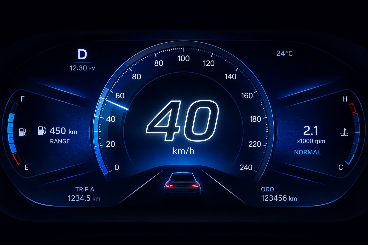
Typography has become an essential part of modern embedded UI design. In earlier embedded systems, text was primarily functional — focused only on displaying information within highly constrained hardware environments. Today, however, embedded interfaces are expected to deliver visually rich and premium user experiences similar to smartphones, tablets, and modern automotive infotainment systems. As display technologies evolve with higher resolutions, smoother graphics, and advanced UI frameworks, typography now plays a critical role in both usability and aesthetics.
Whether it is an automotive dashboard, industrial HMI, smart appliance, medical device, or infotainment display, users expect text to remain readable, visually appealing, and consistent across different operating conditions. Achieving this balance is not always easy. Dynamic backgrounds, gradients, animations, and varying lighting conditions can reduce text clarity and negatively impact user experience.
To address these challenges, Sparklet UI Designer provides the Text Stroke feature, allowing designers to add customizable outlines around text characters. Designers can enable or disable the stroke effect, customize the stroke width, and select stroke colors that match the UI theme or branding requirements. This simple yet powerful feature helps improve readability, create stronger visual emphasis, and enhance the overall appearance of embedded interfaces.
In this article, we explore how Text Stroke works in Sparklet UI Designer, why it matters in modern embedded UI development, and how it can be effectively used across different embedded applications.
Why Typography Matters in Embedded UI
Typography is one of the most visible aspects of any user interface. Users continuously rely on text elements to understand system status, navigation instructions, warnings, menu labels, and operational data. Poor typography can make even a well-designed interface feel cluttered or difficult to use.
In embedded systems, typography becomes even more important because displays are often smaller and operate in challenging environments such as bright sunlight, low-light conditions, or fast-moving automotive scenarios. Text must remain readable regardless of the background or lighting condition.
Modern embedded UIs also use layered graphics, animations, transparent elements, and dynamic themes. While these features improve visual appeal, they can reduce text visibility if typography is not handled carefully. Text Stroke helps solve this problem by separating text visually from the background using an outline effect.
By improving text clarity and enhancing contrast, typography with stroke effects contributes to better usability, accessibility, and user confidence.
What is Text Stroke Effect in Sparklet UI Designer?
The Text Stroke feature in Sparklet UI Designer allows developers and designers to apply an outline around text characters. This outline improves the separation between text and the surrounding background, making the content easier to read while also creating a visually modern appearance.
Sparklet provides flexible customization options for text strokes, including:
- Enabling or disabling the stroke effect
- Adjusting the stroke width
- Choosing custom stroke colors
These controls allow designers to adapt typography for different UI themes and product requirements. A thin subtle outline can improve readability without changing the overall design language, while thicker strokes can create bold visual emphasis for warnings, headings, or highlighted information.
Because the stroke settings are integrated directly within the Sparklet UI Designer workflow, developers can visually fine-tune text appearance without relying on additional graphic assets or complex rendering logic.
Improving Text Visibility with Text Stroke
One of the biggest advantages of Text Stroke is improved text visibility. Embedded interfaces often contain complex backgrounds, animated graphics, or dynamic visual effects that can make plain text difficult to read.
For example, in automotive instrument clusters, text may appear over gradients, maps, glowing indicators, or animated speedometers. Without proper contrast, important information such as navigation instructions or warning messages may become less noticeable.
Adding a stroke around text creates a clear visual boundary that separates the text from the background. Even a subtle outline can significantly improve readability in both bright and dark themes.
Text Stroke is especially useful in scenarios such as:
- Outdoor industrial HMIs exposed to sunlight
- Automotive night-mode displays
- Smart appliance interfaces with animated backgrounds
- Gaming-inspired infotainment systems
- Medical devices displaying critical alerts
Instead of redesigning the background or changing text colors repeatedly, designers can use stroke effects to maintain consistent readability across different UI conditions.
Creating Modern and Premium UI Designs
Typography is not only about readability — it also contributes to the emotional and visual quality of the interface. Modern digital products use typography as a branding and styling element to create premium user experiences.
Text Stroke allows embedded interfaces to achieve a polished and visually rich appearance without adding unnecessary graphical complexity. Outlined text can create depth, emphasis, and visual layering that makes the UI feel more modern and dynamic. For example:
- Automotive infotainment systems often use glowing outlined text for navigation prompts.
- Gaming-style dashboards use bold stroke effects for futuristic visual themes.
- Premium smart appliances use clean outlined typography to match minimalist UI aesthetics.
By combining stroke width and color customization, Sparklet gives designers the flexibility to create typography styles that align with product branding while maintaining clarity and consistency.
Practical Use Cases of Text Stroke in Embedded Systems
The Text Stroke feature can be applied across a wide range of embedded UI applications.
Automotive Instrument Clusters
Modern automotive displays contain large amounts of information including speed, fuel status, navigation instructions, and alerts. Text Stroke helps maintain readability while supporting premium dashboard designs.
Warning and Alert Messages
Critical system messages need strong visual emphasis. Adding a contrasting outline helps warning text stand out immediately from the background.
Industrial HMIs
Industrial interfaces are frequently used in harsh lighting conditions. Outlined text improves readability when operators view screens from a distance or under bright factory lighting.
Smart Appliances and IoT Devices
Compact devices with small screens benefit from improved text clarity, especially when using colorful or animated UI themes.
Infotainment Systems
Media titles, notifications, and navigation instructions often appear over dynamic backgrounds. Text Stroke helps preserve readability without reducing visual richness.
These practical applications show how typography enhancement directly improves both functionality and user experience.
Design Best Practices for Using Text Stroke
While Text Stroke is powerful, it should be used thoughtfully to maintain a clean and balanced interface.
A very thick outline may reduce readability by overpowering the text itself. In most cases, subtle stroke widths provide the best balance between visibility and aesthetics.
Designers should also ensure sufficient contrast between the text color, stroke color, and background. For example, white text with a dark outline works effectively on bright or animated backgrounds.
Consistency is equally important. Stroke styles should remain uniform across related UI elements to avoid visual clutter. Using multiple stroke colors or inconsistent widths can make the interface feel unstructured.
Another good practice is adapting stroke intensity based on UI hierarchy. Large headings or warning alerts may require stronger outlines, while smaller labels may only need subtle enhancement.
Performance and Scalability in Embedded Systems
Embedded systems often operate under hardware constraints, making performance optimization an important consideration. Sparklet UI Designer allows developers to add Text Stroke effects without significantly increasing UI complexity.
Since stroke rendering is integrated into the typography system, designers can create visually enhanced text without relying on separate image assets. This improves scalability across different resolutions and display sizes.
Text Stroke also helps maintain consistent typography quality across product variants. Whether the UI is deployed on small compact displays or larger high-resolution panels, outlined text continues to provide visual clarity and design consistency.
As embedded devices continue evolving toward richer graphical experiences, scalable typography features like Text Stroke become increasingly valuable for professional UI development.
Conclusion
Modern embedded UI design requires typography that is not only functional but also visually refined and adaptable to different environments. Plain text alone is often insufficient for maintaining readability across dynamic backgrounds, complex graphics, and varying lighting conditions.
The Text Stroke feature in Sparklet UI Designer provides a simple yet highly effective solution for enhancing embedded typography. By allowing designers to customize stroke enablement, width, and color, Sparklet makes it possible to improve readability, strengthen visual hierarchy, and create premium UI experiences.
From automotive dashboards and infotainment systems to industrial HMIs and smart devices, Text Stroke helps embedded interfaces look clearer, sharper, and more modern. As embedded UI expectations continue to grow, advanced typography features like Text Stroke will play an increasingly important role in delivering high-quality user experiences.
https://sparkletui.com/documentation/flint-ui-designer/widgets/widgets.html#labels-widget