Flint is equipped with an extensive assortment of pre-designed widgets, which can be readily customized through uncomplicated property configurations.
With simple drag-and-drop, a user can create a user interface without having design expertise.
Here are some sample projects included for better understanding of widgets and their usage. Please navigate to the Downloads Section in order to access and download the Flint projects.
Flint has a collection of Container widgets that helps to group multiple widgets and manage them efficiently.
The FixedView widget allows users to place child widgets in fixed positions.
There are three different styles available
Fill color - To set a fill-colored background.
Transparent - To set a transparent background.
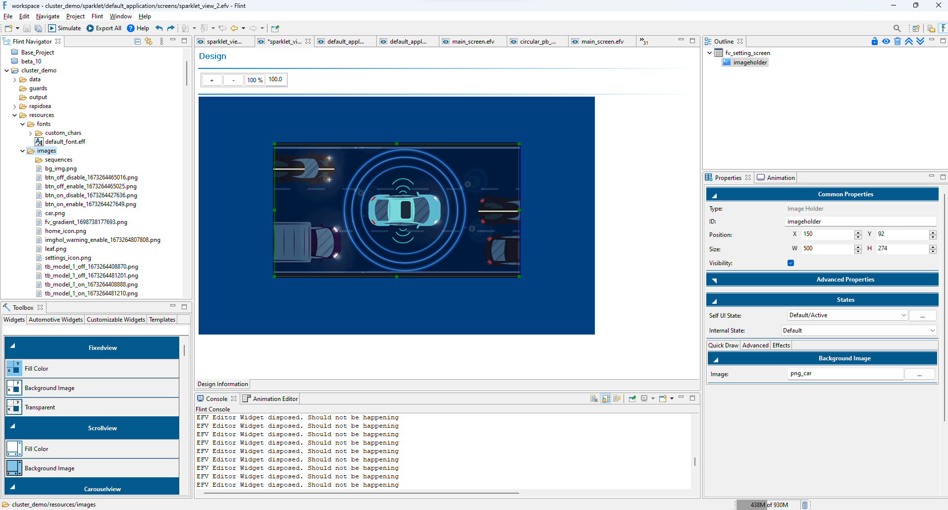
Background image - To set the background with customized images.
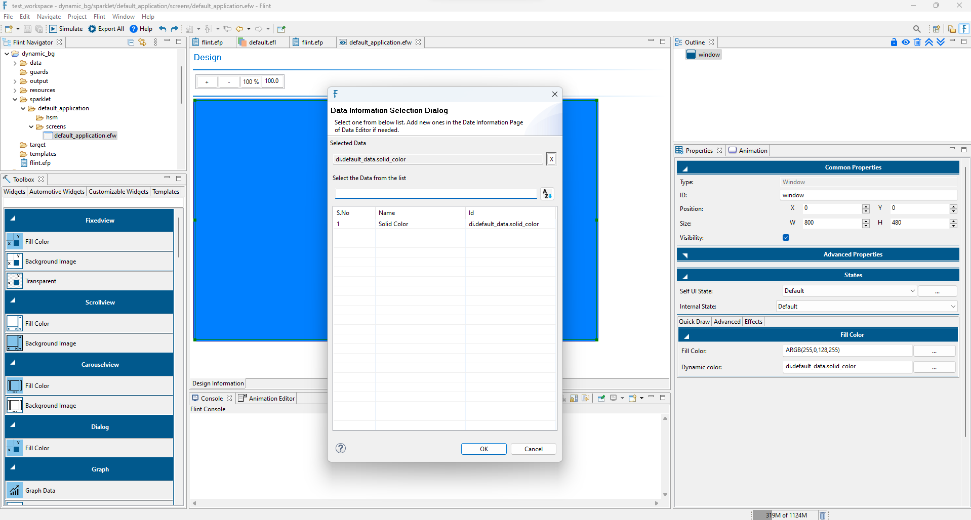
In Flint, users can dynamically change the background color at runtime by mapping Data Variable in the “Dynamic color” option under the Fill color layer properties. The Data variable value should range from 0(#000000 for black) to 4294967295 (#FFFFFFFF for white).
The Labels widget is an input element which holds the alphanumeric data, allowing users to enter text information. Within its properties, users can customize various aspects of the text layer:
Text Alignment: Horizontal and vertical alignment options are available to adjust the position of the text within the label’s boundaries.
Font: Users can choose the desired font file for the text within the label.
Text: This option allows users to input text directly. This is useful for fixed text content that doesn’t need to change dynamically.
Text DB (Data Bridge): This option enables dynamic text changes at runtime by mapping data bridges.
Text color: Users have the option to choose a specific color for the text.
Text Spacing: Users can adjust the spacing between characters in the text. The text spacing value can be adjusted within the range of -64 to 64. If the negative value of text spacing exceeds the width of the text area, the character spacing value resets to zero in Flint.This ensures that the characters don’t overlap or become unreadable due to excessive negative spacing.Please note that characters may crop when a negative spacing value is used in Italic fonts, particularly with Right & Top Alignment and Right & Bottom Alignment.
Text Overflow: Flint offers a Text Overflow feature with various options:
Clip – To clip the overflowing text to make it fit in the space available.
Marquee - If the text exceeded the size of the widget, it would automatically scroll horizontally.
Ellipsis End/Start - This feature enables users to manage text overflow within a text view. By utilizing the Ellipsis property, the leading or final parts of the text can be automatically replaced by an ellipsis sign “…”, ensuring that the displayed text fits within the view’s bounds without unsightly clipping.
Multiline - Wraps long text into multiple lines so that the complete text is displayed within the available space.
Text Direction: Flint supports text rotation, allowing text to be rotated at angles of 90, 180, and 270 degrees. For further details on text rotation, please refer Text Rotation section.
The Text Edit widget is primarily used to facilitate text input through an on-screen keyboard (OSK). When the OSK is enabled, any text entered via the keyboard is displayed within the Edit Box. This widget serves as an interactive text input field, allowing users to type, edit, and view text in real time.
Flint provides powerful Graph Widgets to help visualize real-time and historical data in an intuitive and interactive manner. Flint supports three types of graph widgets:
Line chart : The Line Chart widget plots a series of data points connected by straight lines. It is ideal for showing trends over time, such as temperature readings, speed variation, or sensor outputs.
Range chart : The Range Chart visualizes a data series that includes minimum and maximum values over a specific period, ideal for monitoring variance, such as temperature or voltage ranges.
Bar chart : The Bar Chart represents categorical data using rectangular bars. Each bar’s length corresponds to the value it represents. Suitable for representing statistics like performance metrics or usage levels.
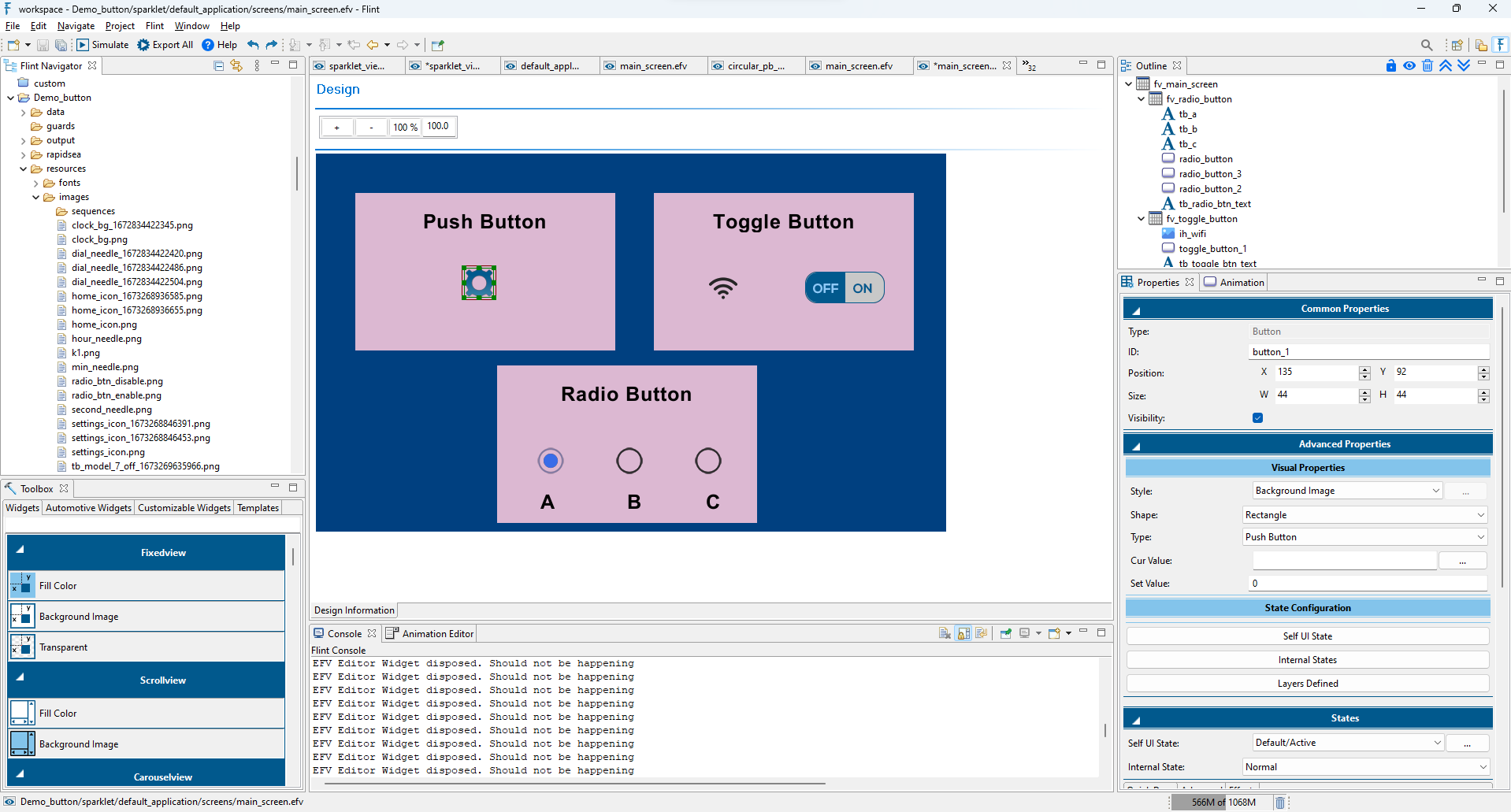
A toggle button widget functions as a switch, allowing users to toggle between two states—typically, an “on” state and an “off” state. When a user interacts with a toggle button, it changes its state, and this change often triggers a specific action or sets a particular configuration.
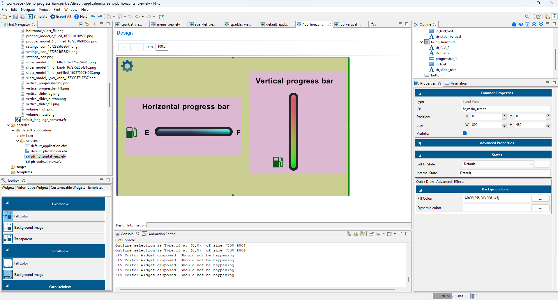
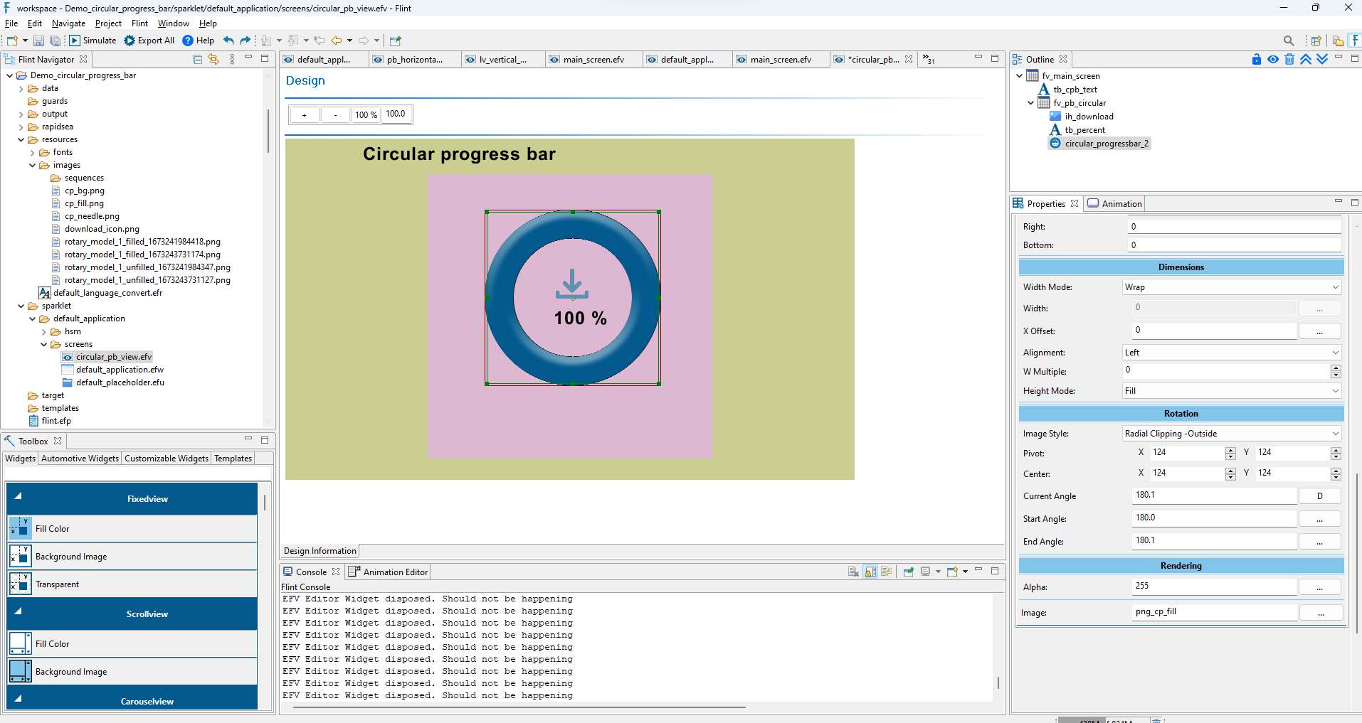
A progress bar widget is used to visually represent the progress of a task or operation. Flint supports both horizontal and vertical progress bar styles.
Progress bars are widely used in various applications, including software installations, file uploads, downloads, data processing, and any other operation where users may experience a wait time and benefit from visual feedback on the progress of the task.
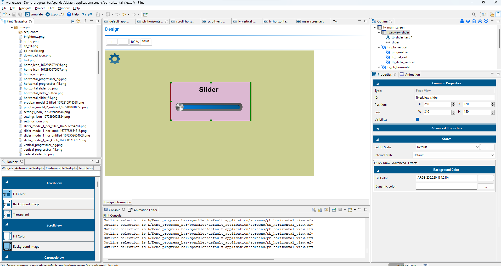
A Slider widget allows users to select a value from a defined range of values by moving the knob. The Slider widget consists of a Seek bar and a Knob (a control that user can drag).
Flint supports both vertical and horizontal sliders.
Sliders are commonly used in various user interfaces to control settings such as volume, brightness, or any parameter that can be adjusted along a continuum.
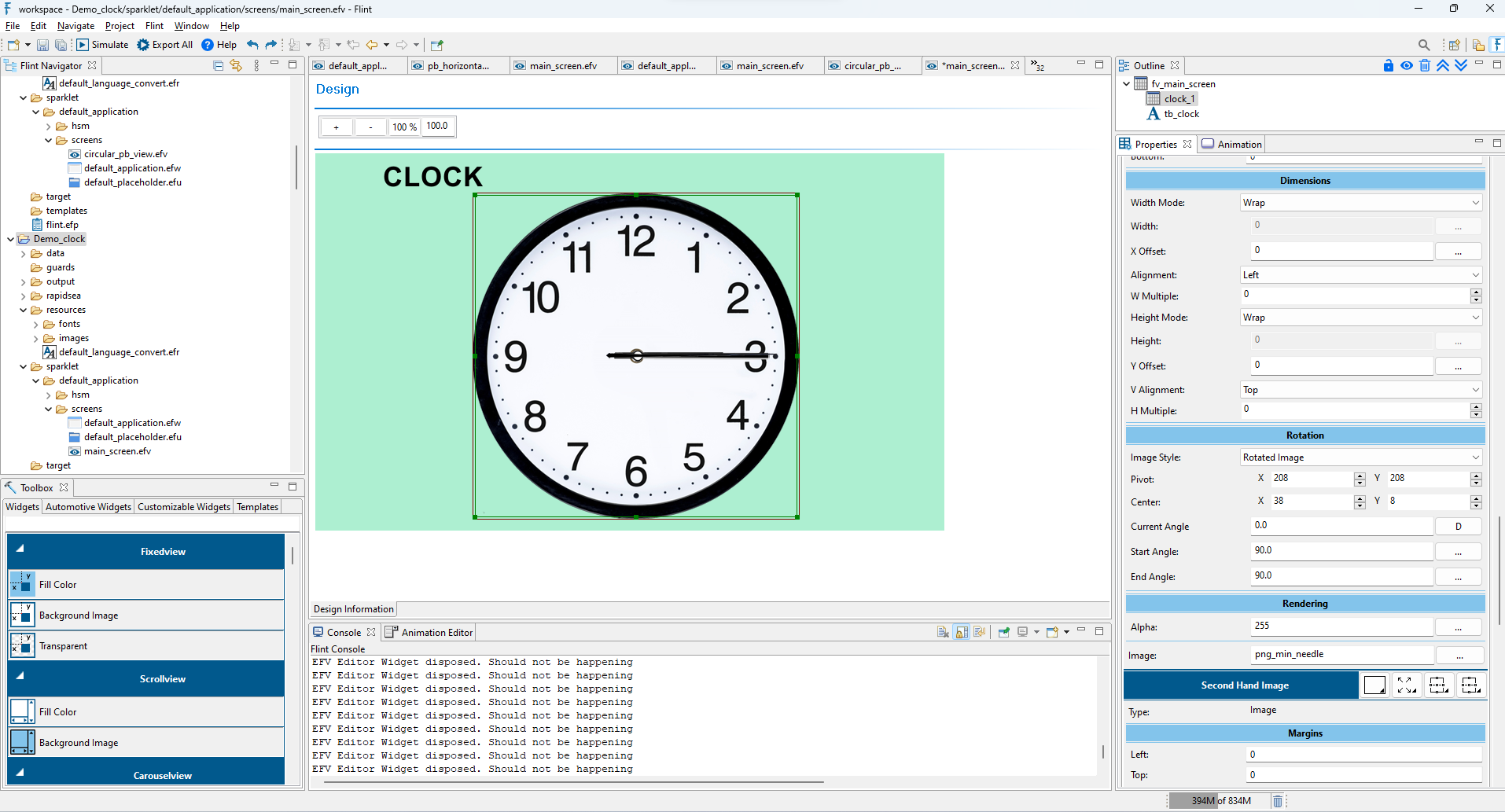
The Dial widget is a circular value input control used to indicate the current value of a metric on a specified range using a pointer or needle. For eg: a Speedometer, which comes with an indicator or pointer to mark the position of the key metric value in a given range.
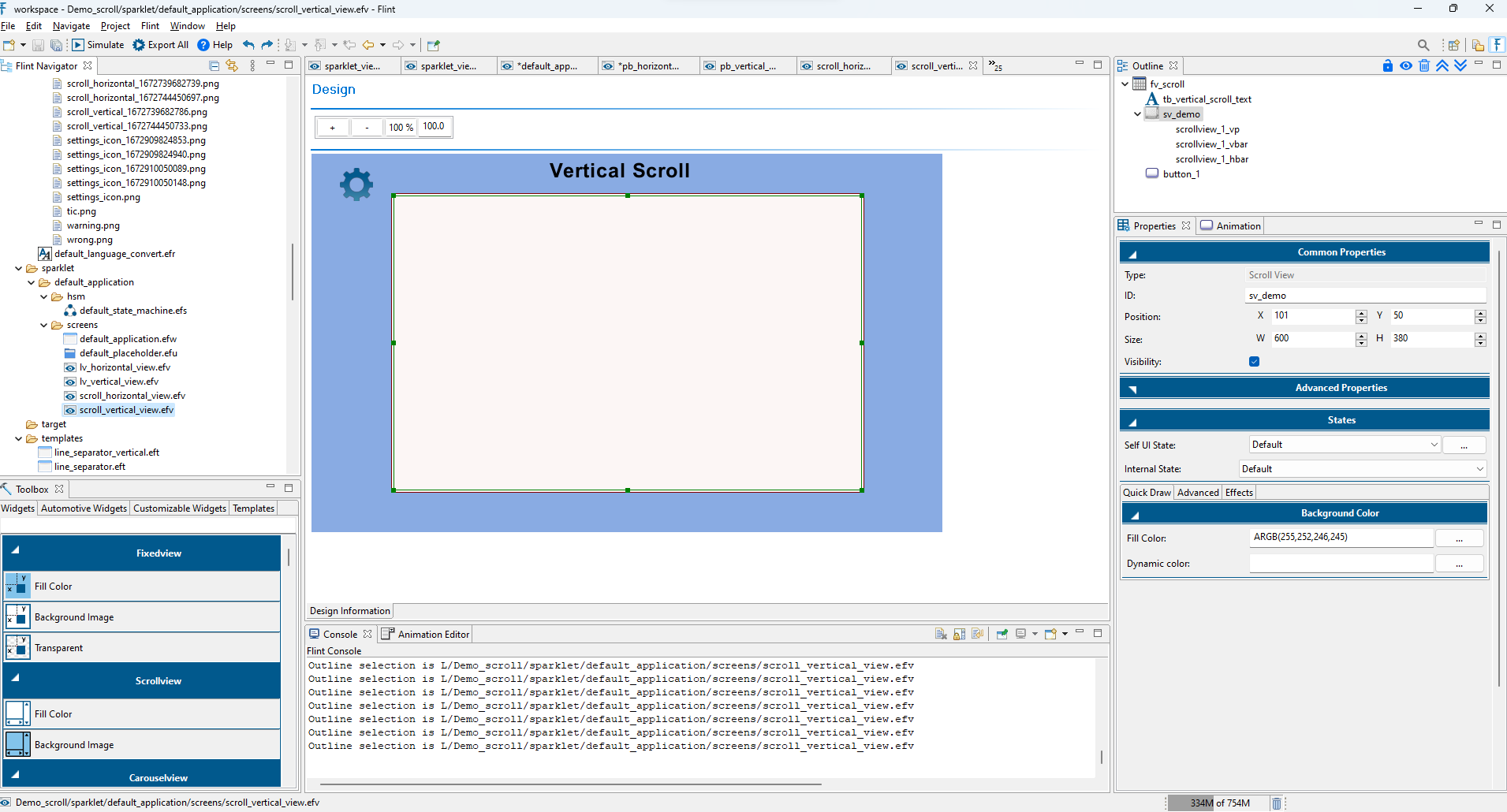
The ScrollView widget is used to create scrollable views. ListView is the most commonly used scrolling widget. ScrollView accepts only one child.
It contains three internal widgets: two Scrollbars and a viewport.
Scrollbar controls the scrolling of content within a viewing area.
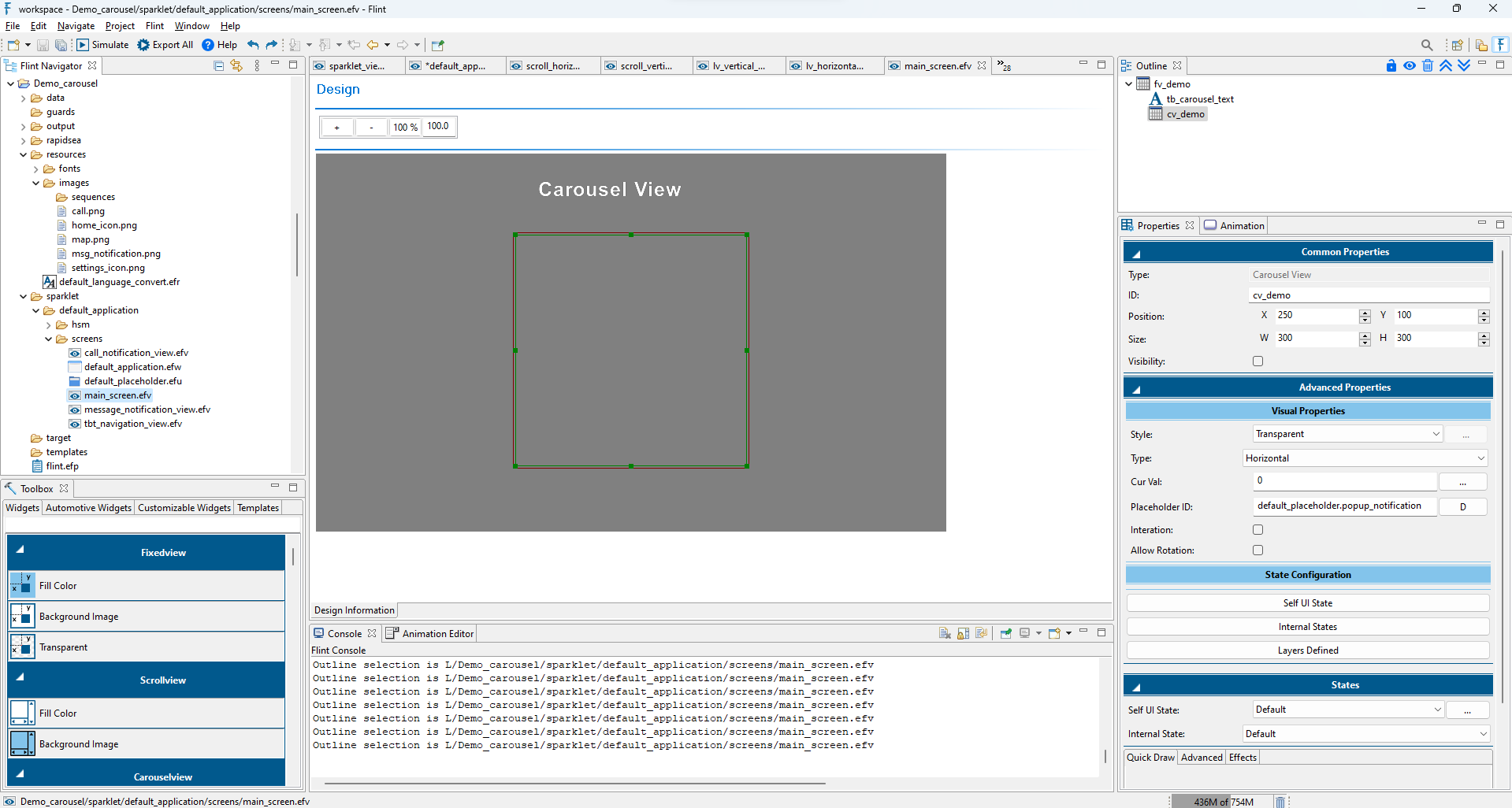
A carousel view widget is used to present a collection of views in a scrolling manner, either horizontally or vertically.
The users can navigate through a set of views by swiping or clicking, similar to a carousel of images or content.
A dialog widget is used to display information, prompt user input, or present messages to the user in the form of a pop-up window. It typically interrupts the current workflow or interaction on the screen and requires the user to take some action or provide a response before continuing.
Types of dialog widgets in Flint
Modal - A modal dialog widget is used to handle tasks such as displaying error messages, requesting user confirmation for an action. It is designed to focus the user’s attention on the specific task or decision at hand, preventing interaction with other parts of the application until the dialog is closed.
Non-Modal - A non-modal dialog widget presents information or options to the user without blocking the interaction with other parts of the user interface.
Unlike modal dialogs, which require the user to respond before continuing with other tasks, non-modal dialogs allow the user to interact with other elements of the interface while the dialog remains open.
Hide on focus lost - A Hide on focus lost dialog widget automatically hides or minimizes itself when it loses focus, meaning when the user clicks outside the dialog or interacts with another part of the application.
When a dialog is set to hide on focus lost, it allows the user to interact with other parts of the application without having to manually close or minimize the dialog.
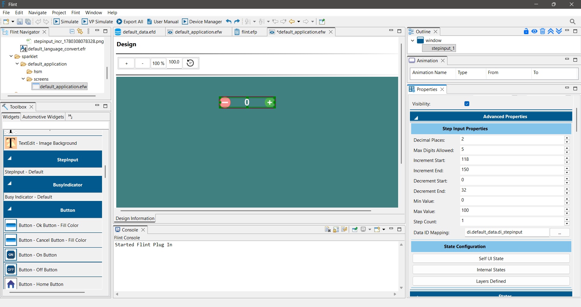
The StepInput widget is used to increase or decrease a numeric value using increment and decrement controls. Each user interaction changes the value by a predefined step count. The widget can be configured with minimum and maximum limits, making it suitable for settings such as quantity selection, volume adjustment, temperature control, and other numeric inputs.
Adding a StepInput Widget
Drag and drop the StepInput widget from the widget toolbox onto the design view.
Assign the images representing the Increment and Decrement controls.
Map a data variable to the text layer to display the current value.
Note: The Data ID configured in the StepInput widget properties must be the same as the Data ID assigned to the Numeric Value text layer. This ensures that the displayed value remains synchronized with the widget data.
The Wheel Picker Widget allows users to select a value by scrolling through a list of items. It is useful for interfaces that require value selection, such as hours, minutes, dates, quantities, and other numeric values.
Follow these steps to add and configure the Wheel Picker Widget in Flint.
Drag and drop the Wheel Picker Widget onto the design area. Position and resize the widget according to your UI layout.
Under Advanced Properties, configure the Wheel Picker settings:
Style – Select the required visual style for the Wheel Picker.
Wheel Picker Style – Select the required scrolling style, such as Wrap or Scale Effect.
Data Info – Map the Wheel Picker to the required Data ID.
Visible Count – Set the number of items visible at the same time.
Min Value – Set the minimum selectable value.
Max Value – Set the maximum selectable value.
Animation Ticks – Set the scrolling animation behavior.
Wheel Item Height – Set the vertical spacing between the displayed items.
Customize the Wheel Picker Appearance : under the Wheel Picker Layer customize its appearance:
Text Color – Set the color of the Wheel Picker items.
Selected Color – Set the color of the selected item.
Selected Font – Select the font for the selected item.
Unselected Font – Select the font for the unselected items.
The Date Picker Widget allows users to select a date using a calendar interface. It is useful for applications that require date selection, such as date settings, appointments, schedules, and event management.
Follow these steps to add and configure the Date Picker Widget in Flint.
Drag and drop the Date Picker Widget onto the design area. Position and resize the widget according to your UI layout.
Under Advanced Properties > Visual Properties, configure the following:
Style – Select the required visual style for the Date Picker.
Date DB – Map the Date Picker to a Data ID. The mapped data variable must be of Date Time type.
The Date Picker provides bounds properties for positioning the different elements of the calendar:
Previous Month Calendar Bounds – Set the X, Y, Width, and Height of the previous month navigation area.
Month Text Bounds – Set the bounds for displaying the month.
Next Month Calendar Bounds – Set the bounds for the next month navigation area.
Previous Year Bounds – Set the bounds for the previous year navigation area.
Year Text Bounds – Set the bounds for displaying the year.
Next Year Bounds – Set the bounds for the next year navigation area.
Label Text Bounds – Set the bounds for the day-of-week labels.
Date Text Bounds – Set the bounds for displaying the date values.
Under the Date Picker layer properties, configure the appearance using the available options:
Background Color – Set the background color of the calendar.
Selected Color – Set the color for the selected date.
Date Text Color – Set the color of the date values.
Date Selected Text Color – Set the text color of the selected date.
Date Today BG Color – Set the background color for the current date.
Date Today Text Color – Set the text color for the current date.
Month Text Color – Set the color of the month text.
Year Text Color – Set the color of the year text.
Date Disabled Text Color – Set the color for disabled dates.
Set the fonts for the different elements of the Date Picker:
Month Font – Font used for the month.
Year Font – Font used for the year.
Date Font – Font used for the date values.
Set the images for navigating through the calendar:
Previous Image – Image used to navigate to the previous month or year.
Next Image – Image used to navigate to the next month or year.
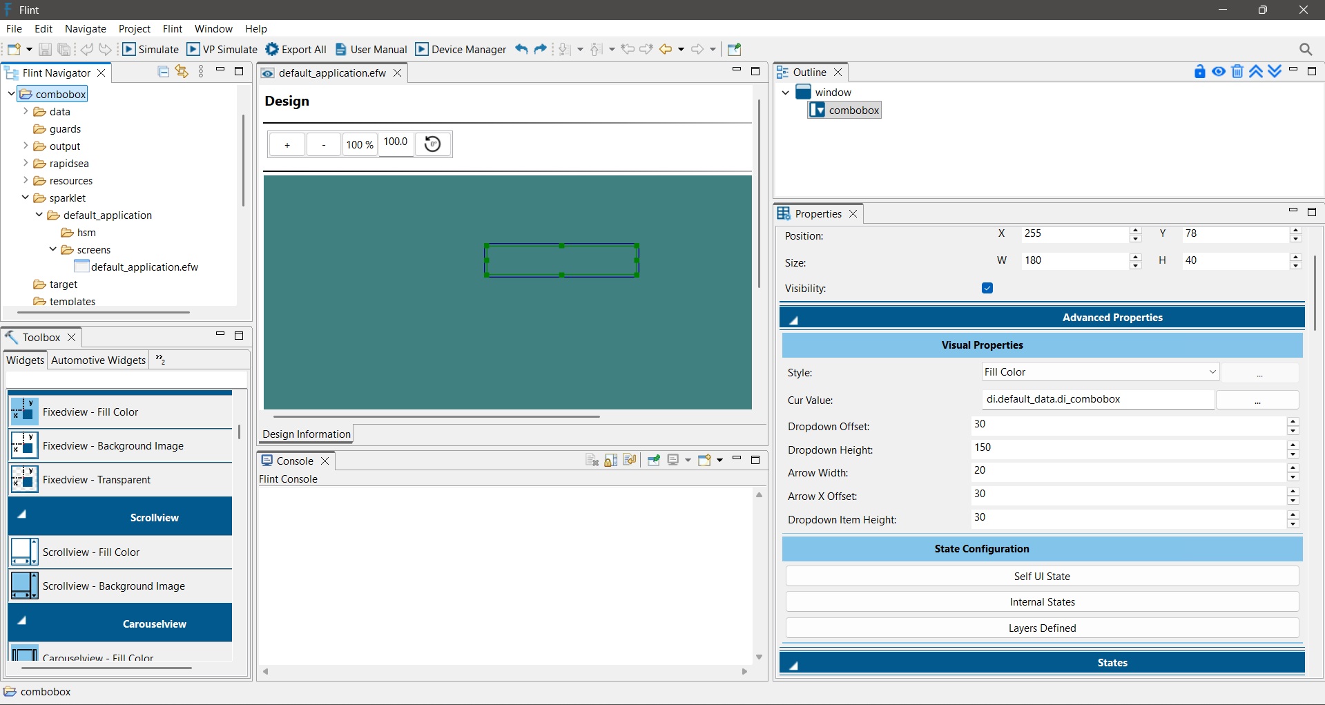
The ComboBox Widget allows users to select a value from a predefined list of options through a drop-down menu. It provides a compact and user-friendly way to present multiple choices while occupying minimal screen space.
Adding a ComboBox Widget
Drag and drop the ComboBox widget from the widget toolbox onto the design view.
Resize and position the widget as required.
Configure the widget properties from the Properties panel.
The following properties control the appearance and behavior of the ComboBox.
Style: Specifies the visual appearance of the ComboBox. For eg. Fill Color
The selected style determines how the ComboBox is rendered on the screen.
Cur Value: Specifies the data item associated with the ComboBox. This data item stores the currently selected value from the drop-down list.
Dropdown Offset: Defines the vertical distance between the ComboBox field and the drop-down list.
Dropdown Height: Defines the total height of the drop-down menu. A larger value allows more items to be displayed simultaneously without scrolling.
Arrow Width: Defines the width of the drop-down indicator arrow displayed inside the ComboBox.
Arrow X Offset: Defines the horizontal position of the arrow inside the ComboBox. This property helps align the arrow properly according to the widget design.
Dropdown Item Height: Defines the height of each item displayed in the drop-down list.
ComboBox Layer Properties
The ComboBox Layer controls the visual appearance of the ComboBox and its drop-down list.
Text Color: Defines the color of the text displayed in the ComboBox.
Dropdown Background Color: Defines the background color of the drop-down menu.
Dropdown Text Color: Defines the text color of the items displayed inside the drop-down menu.
Dropdown Selected Background Color: Defines the background color of the currently selected item in the drop-down list. This helps users easily identify the selected option.
Font: Specifies the font used for displaying ComboBox text.
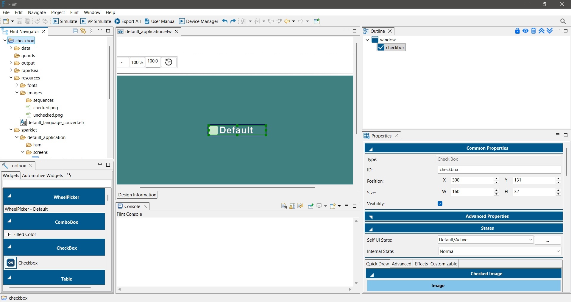
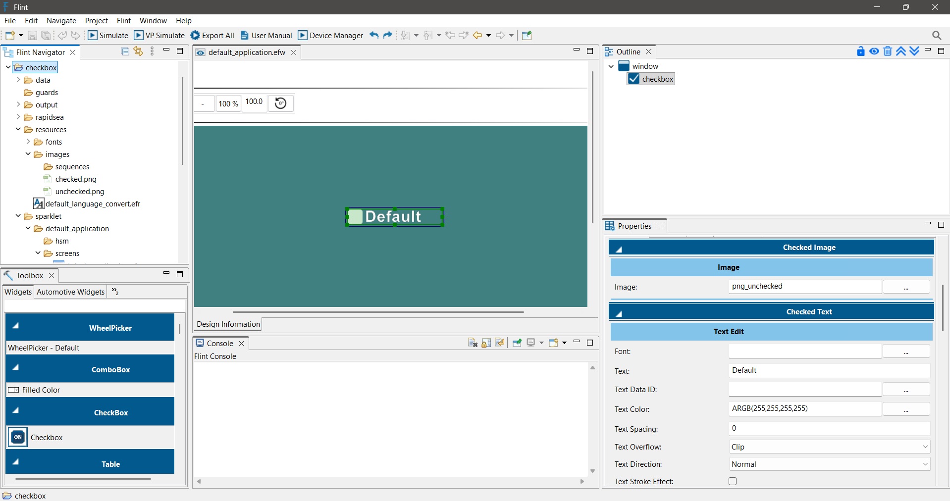
The Checkbox Widget allows users to enable or disable an option by selecting or clearing a check box. It is commonly used for settings, preferences, feature activation, and configuration screens where a user needs to choose between two states.
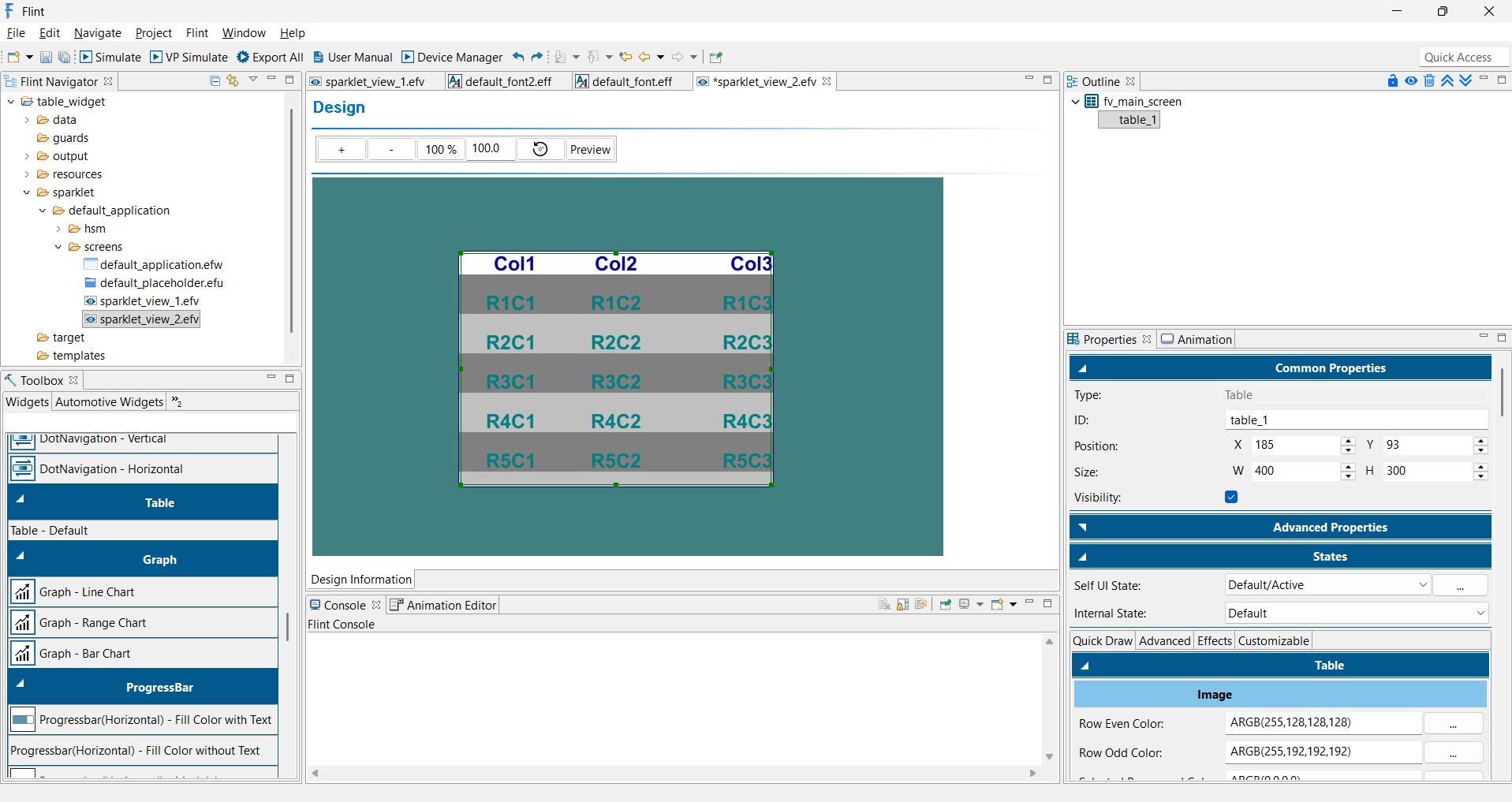
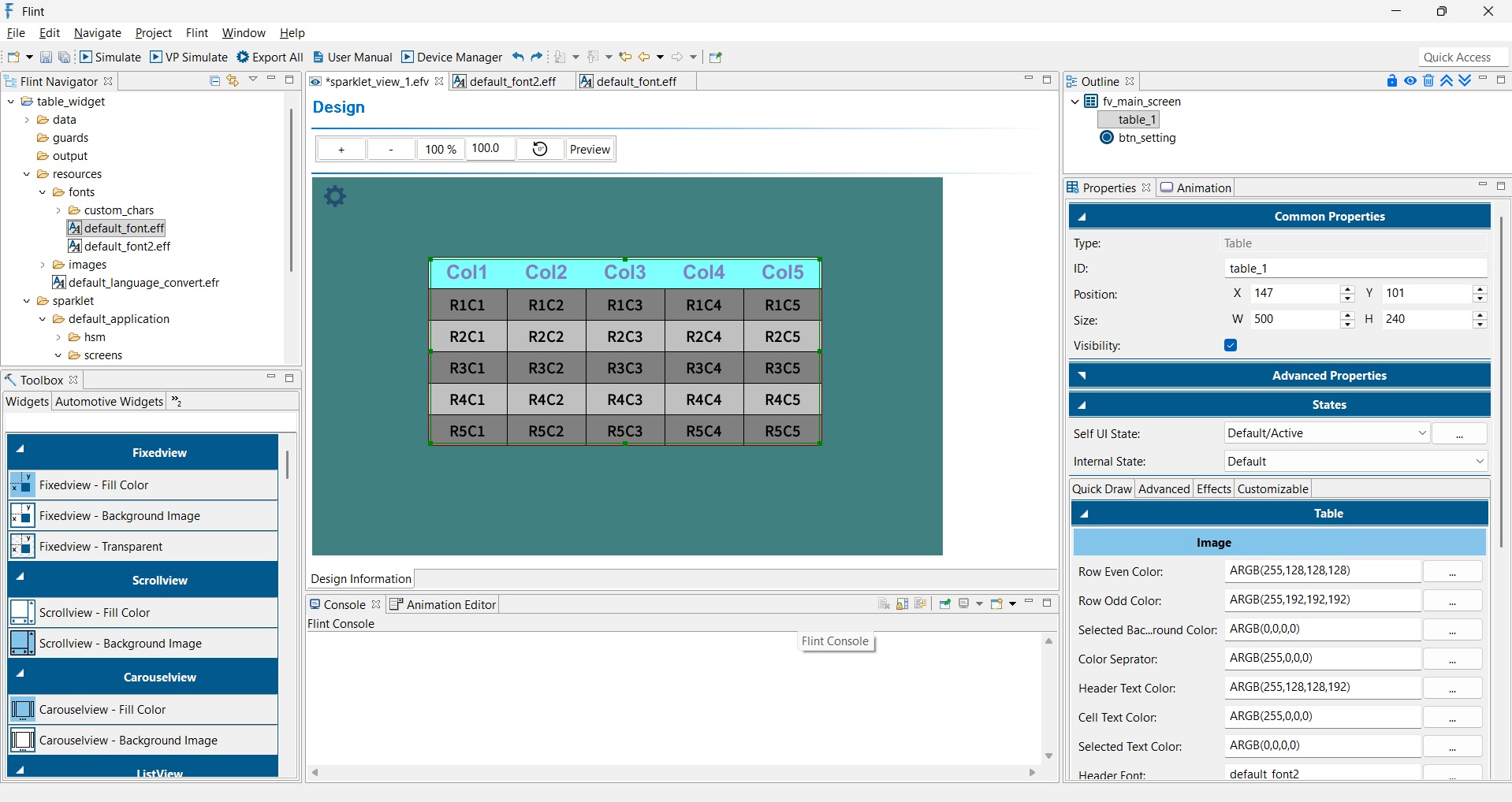
The Table Widget is used to display data in a structured row-and-column format. It is useful for presenting records, logs, settings, reports, measurements, or any tabular information in an embedded user interface.
The Table Widget supports customizable column configurations, row appearance, fonts, colors, and optional scrollbars.
Adding a Table Widget
To add a Table Widget to the design:
Drag and drop the Table Widget onto the Design View.
Resize and position the widget as required.
Configure the table properties from the Properties panel.
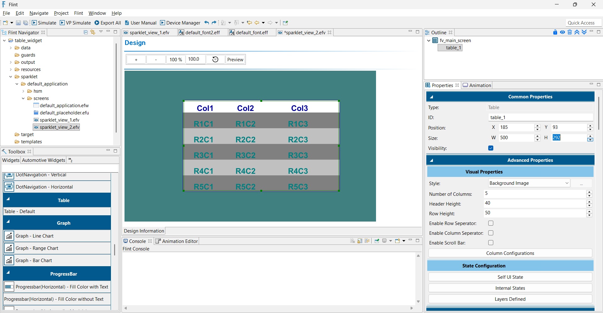
The following properties are available under Advanced Properties.
Style - Defines the visual style of the table.
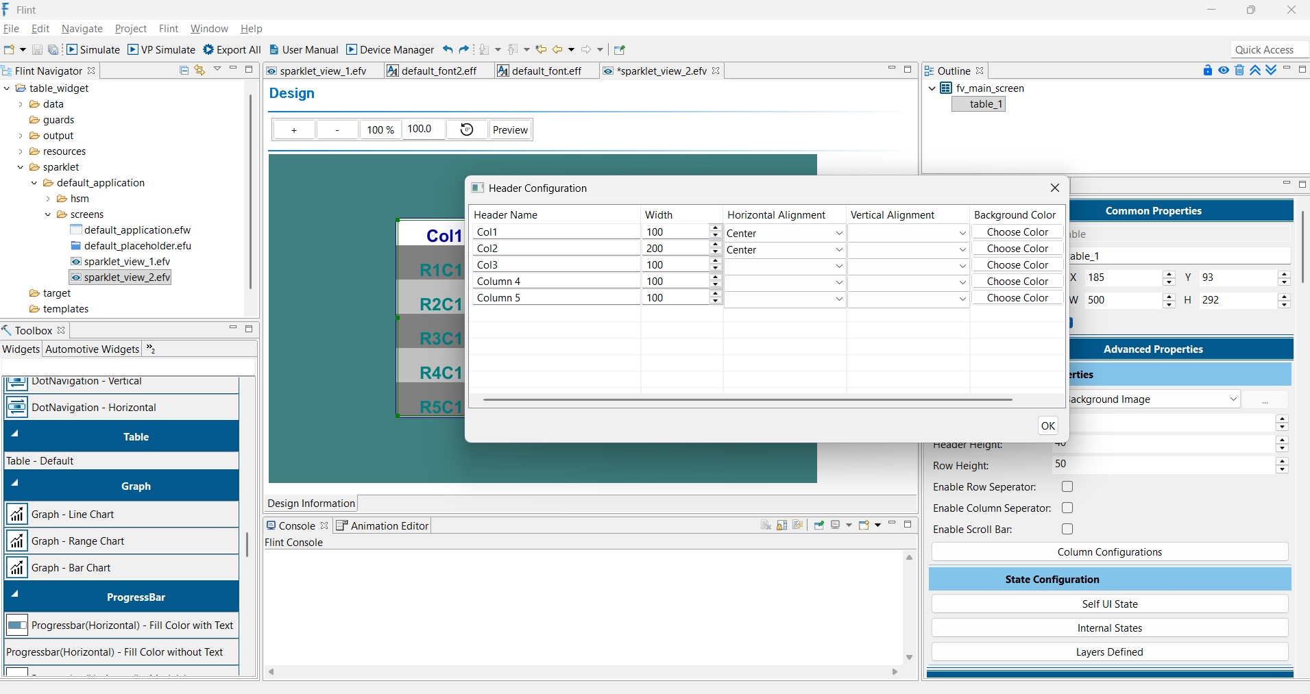
Number of Columns - Specifies the total number of columns displayed in the table. Each column can be configured individually through the Column Configurations dialog.
Header Height - Defines the height of the header row. A larger value increases the header size and provides more space for column titles.
Row Height - Defines the height of each table row. Increasing the row height improves readability, especially on touch-enabled displays.
Enable Row Separator - Displays horizontal separator lines between rows.
Enable Column Separator - Displays vertical separator lines between columns.
Enable Scroll Bar - Displays a scrollbar when table content exceeds the visible area.
The Dot Navigation Widget provides a simple and intuitive way to indicate screen or content navigation status, often used in carousels or paginated views. After adding the Dot Navigation Widget, configure the following properties:
Style – Select the required visual style for the dot navigation.
Type – Select the dot arrangement: Horizontal Dot Navigation or Vertical Dot Navigation.
Cur Val – Set the current value to indicate the active dot.
Dot Count – Set the total number of dots to be displayed.
Dot Width – Set the width of each dot.
Dot Height – Set the height of each dot.
Dot Gap – Set the spacing between the dots.
Wrap – Enable this option if the navigation should wrap around when reaching the first or last dot.
Under Dot Image layer, configure the images for the active and inactive dots:
Active Image – Select the image to display for the currently active dot.
Inactive Image – Select the image to display for the remaining dots.
This widget helps users easily track and navigate between screens.
The Grid View Widget is used to arrange multiple items in a structured grid layout. It is useful for displaying widgets or placeholders in an organized way, such as menus, lists, dashboards, and other grouped content.
The Grid View supports four alignment types:
Horizontal - Left Align – Arranges items horizontally from left to right.
Horizontal - Right Align – Arranges items horizontally from right to left.
Vertical - Top Align – Arranges items vertically from top to bottom.
Vertical - Bottom Align – Arranges items vertically from bottom to top.
The following properties are available under Advanced Properties.
Style – Select the required visual style.
Type – Select the required alignment type.
Child Type – Select whether the grid contains a Widget or a Placeholder.
Placeholder ID – If Placeholder is selected as the Child Type, specify the required Placeholder ID.